Test localhost on real mobile devices.
No tunnel, no USB cable, no deploy. Bezel frames the tab you already have open, whether it is localhost, a staging URL or a page behind a login, inside a real device, right in your browser. Your session comes with it, and nothing leaves your machine.
localhost · staging · behind a login · no tunnel · 100% local
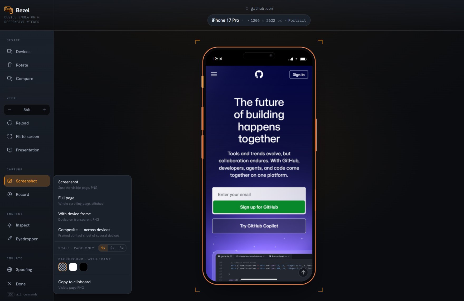
Testing localhost on a phone used to be a chore.
Start a tunnel, or deploy a preview, or dig out a cable and a spare phone, then do it again on the next change. Cloud device farms cannot even reach your machine. Bezel removes the whole detour: it works on the tab in front of you, so the loop from code to a real mobile view is instant.
- It is already open. Bezel frames the current tab. Whatever is on your screen, on any port, is one click from a real device view.
- Localhost simply works. No cloud device can reach 127.0.0.1 without a tunnel. Bezel runs locally, so your dev server needs no exposing and no extra setup.
- Behind a login works too. Your session and cookies are already in the tab, so authenticated dashboards and gated staging frame without a separate login dance.
- Nothing leaves your machine. The page, the screenshots and the settings all stay local. Your un-shipped work is never uploaded to a third-party service.
Works with whatever you build. Bezel frames the rendered page, so it does not care how the page was made. React, Vue, a static site or plain HTML all behave the same inside a real device.
More than half of all web traffic is mobile. Most of it is checked on a desktop window.
A shelf of real test phones costs thousands and is out of date within a year. Bezel is free, runs in the browser you already have, and stays current with the latest devices — so the mobile view you sign off on is the one your visitors actually get.
From local build to real device in seconds
- Open your site. Point the tab at localhost, your staging URL, or any page you are working on.
- Click Bezel. The current tab drops into a real device frame with true viewport, density, touch and client hints.
- Pick a device. Switch between 90+ phones, tablets and foldables and watch the page reflow. Iterate without leaving your editor loop.