Test your website on foldables.
Bezel frames your page in a Galaxy Z Fold, Z Flip, Pixel Fold or Razr, folded and unfolded, and the code inside sees each real screen. A foldable is two devices in one, and almost nobody tests either. Now you can, without buying one.
Z Fold · Z Flip · Pixel Fold · Razr · cover + unfolded · runs 100% local
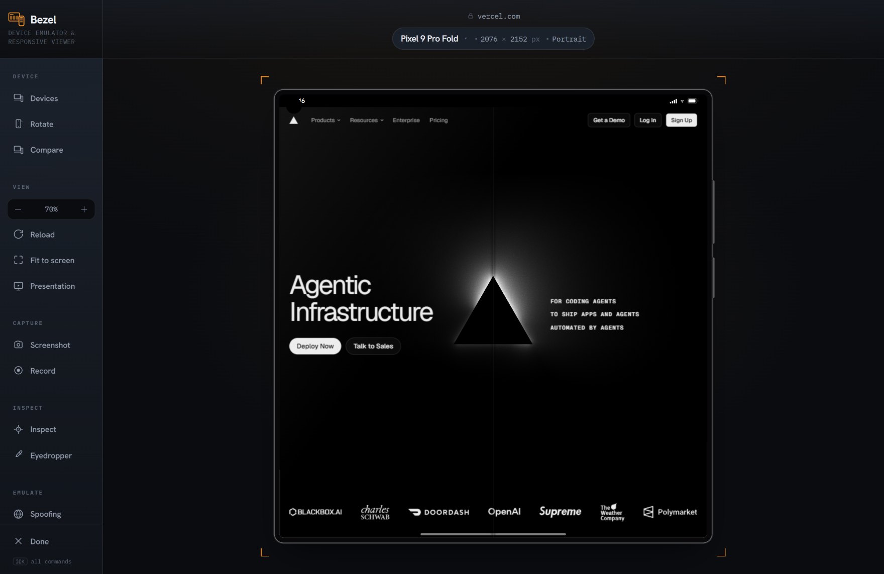
A foldable is two devices, and both get skipped.
The cover screen is narrower than any phone you designed for. Unfolded, it is nearly a tablet. Most sites have never been seen on either, because most teams own no foldables. Bezel carries both postures of each device, so you can check the screens your visitors are already using.
- Cover and unfolded, both real. Separate profiles for each posture, from a 323 px cover screen to a 928 px unfolded screen, with the correct density for each.
- The narrow-cover stress test. Cover screens are narrower than a small phone. If your layout survives there, it survives anywhere. If it does not, you will see it in one click.
- Near-tablet unfolded widths. Unfolded screens land in tablet territory, where phone and desktop layouts collide. Check your grids and navigation at widths you have probably never tested.
- No hardware required. Foldables are expensive and most teams own none. Bezel gives you accurate viewport, density and touch for each without the shelf of phones.
Works with whatever you build. Bezel frames the rendered page, so it does not care how the page was made. React, Vue, a static site or plain HTML all behave the same inside a real device.
More than half of all web traffic is mobile. Most of it is checked on a desktop window.
A shelf of real test phones costs thousands and is out of date within a year. Bezel is free, runs in the browser you already have, and stays current with the latest devices — so the mobile view you sign off on is the one your visitors actually get.
10 foldable profiles
Galaxy Z Fold and Flip, Pixel Fold and Razr, with cover and unfolded screens where they differ.