Test your website on a real iPhone.
Bezel frames your page in an iPhone 17, 16, 15 or SE, and the code inside sees a real iPhone. Safari’s true viewport width, 3x Retina pixels, a touch device, and honest client hints. Not a narrow browser window pretending to be a phone.
iPhone SE → iPhone 17 Pro Max · iOS 26 · runs 100% local
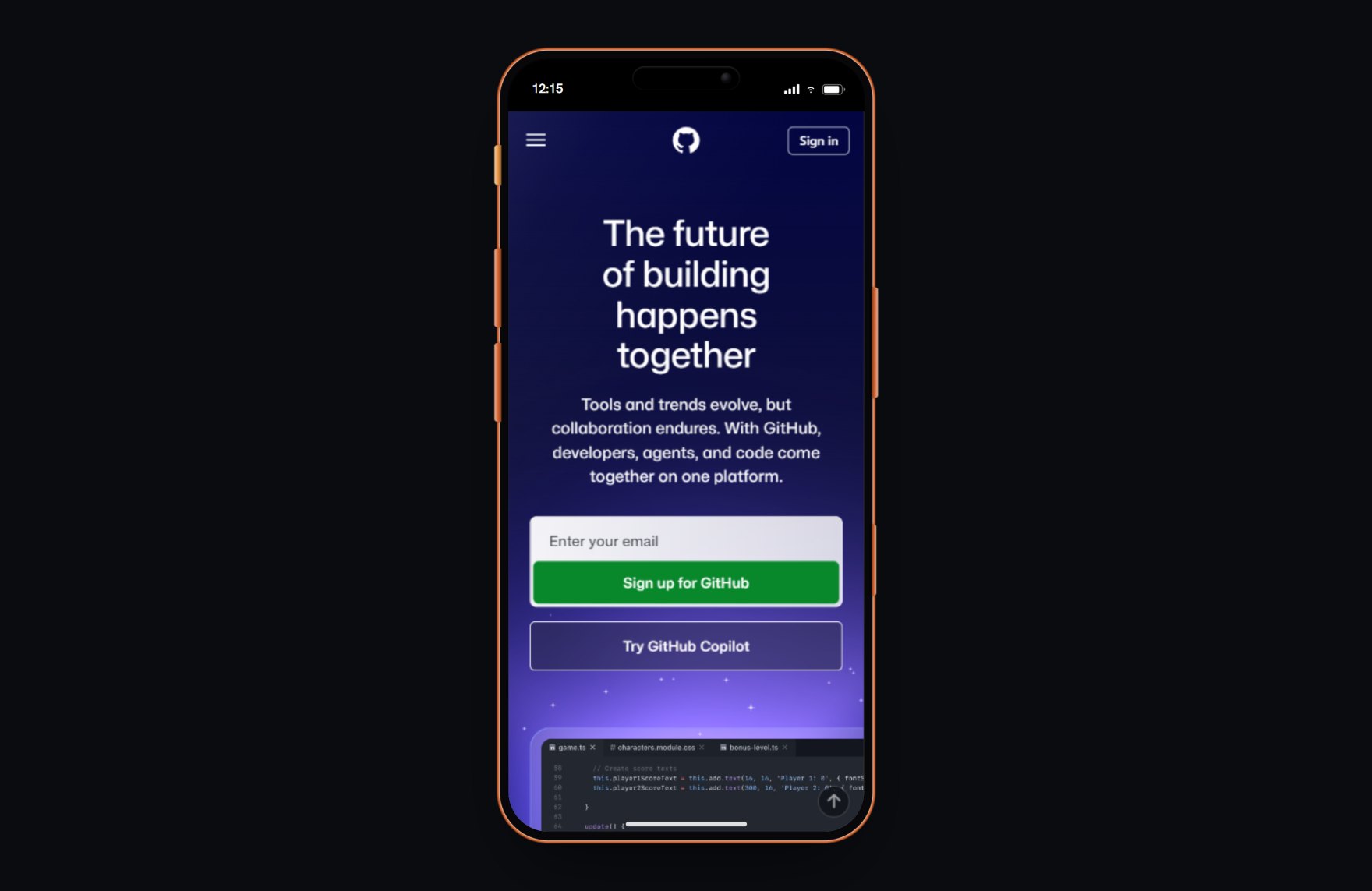
A narrow desktop window is not an iPhone.
Dragging your browser narrow changes the width and nothing else. A real iPhone loads a different bundle, renders at 2x or 3x density, reports touch instead of a mouse, and sends its own client hints. Test on a fake phone and you are guessing. Bezel matches all of it, so what you see is what ships.
- Real Retina density. iPhones render at 2x and 3x. Bezel renders your page at the exact pixel density, so hairline borders, shadows and @2x/@3x assets resolve like hardware instead of looking soft on a 1x laptop.
- True Safari viewport. 375, 390, 393, 402, 430 and 440 CSS px, the widths real iPhones use. Your media queries fire at the breakpoint that matters, and safe-area insets for the notch and Dynamic Island are respected.
- Reports as a touch device. maxTouchPoints, ontouchstart and pointer: coarse all report touch, so touch-first layouts, tap targets and hover fallbacks render the way they should. (Your mouse still clicks — Bezel spoofs what the page detects, not the input itself.)
- Honest User-Agent and client hints. Bezel sets the iPhone’s User-Agent and the mobile client-hint flag and drops the desktop hints, and the page’s navigator.userAgentData reports iPhone, so your server and framework serve the mobile bundle, images and layout.
Works with whatever you build. Bezel frames the rendered page, so it does not care how the page was made. React, Vue, a static site or plain HTML all behave the same inside a real device.
More than half of all web traffic is mobile. Most of it is checked on a desktop window.
A shelf of real test phones costs thousands and is out of date within a year. Bezel is free, runs in the browser you already have, and stays current with the latest devices — so the mobile view you sign off on is the one your visitors actually get.
18 iPhones, ready to frame
Each one carries its real viewport, pixel density and iOS version. Pick one and your page reflows exactly as it would on the glass.