Test your website on a real iPad.
Bezel frames your page in an iPad mini, Air or Pro, and the code inside sees a real tablet. True tablet viewport, 2x density and a touch device. The awkward middle where too-wide-for-mobile meets too-narrow-for-desktop is exactly where tablet bugs live.
iPad mini → iPad Pro 13" · Galaxy Tab · iPadOS 26 · runs 100% local
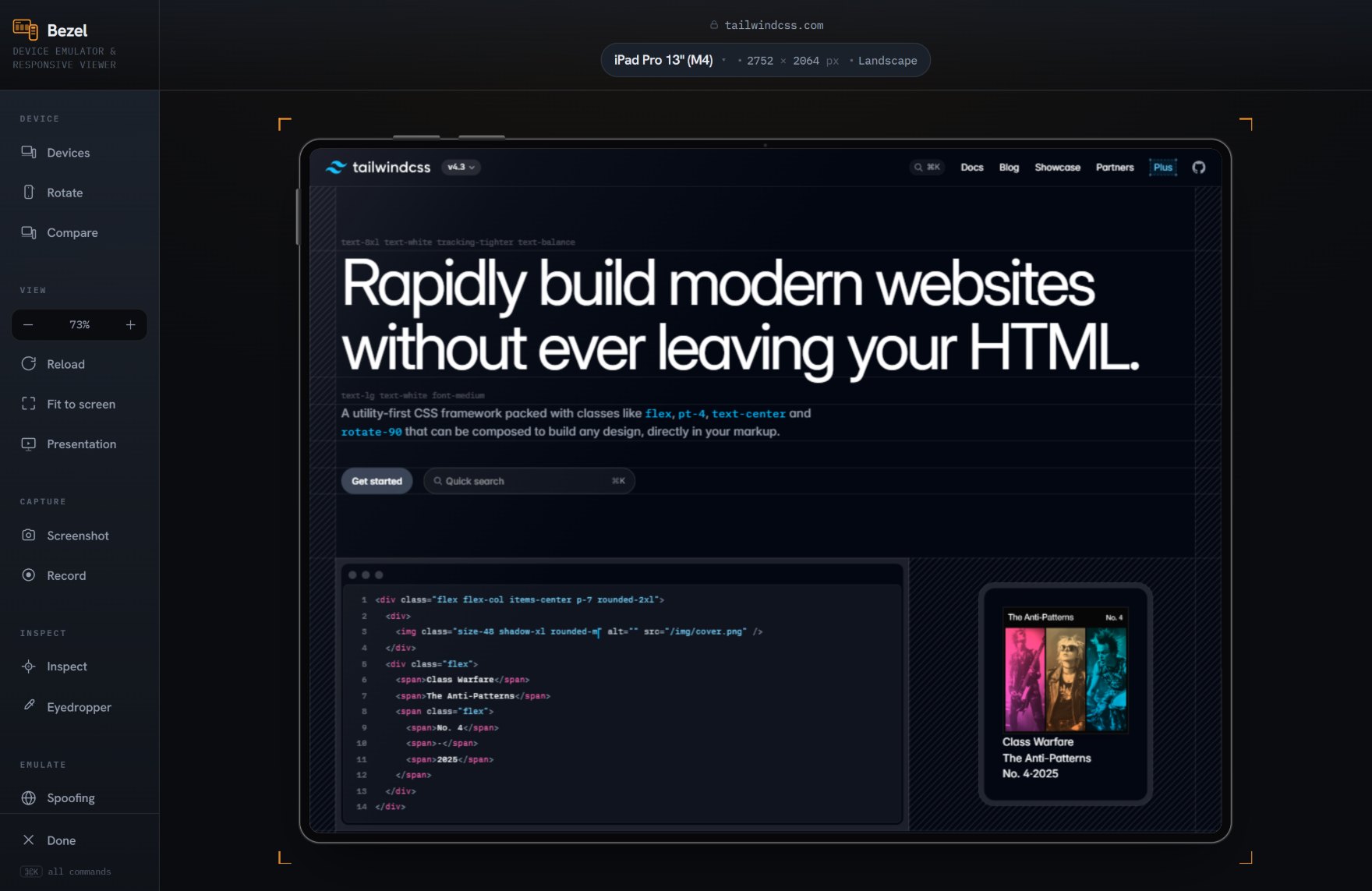
Tablet is the layout nobody checks.
Teams test the phone and the laptop and assume the tablet takes care of itself. It rarely does. Grids collapse to one column too early, navigation meant for a mouse meets a finger, and split-view widths appear that no one designed for. Bezel puts the real tablet in front of you in one click.
- Real tablet widths. From 744 px iPad mini to 1024 px iPad Pro 13", the widths where phone and desktop layouts fight. See exactly where your grid switches and whether it switches too soon.
- Correct 2x density. iPads render at 2x. Bezel matches it, so retina assets and fine detail resolve the way they will on the panel.
- Reports as a touch device. pointer: coarse and hover: none report to the page, so hover menus, drag handles and tap targets fall back to their touch behaviour, which is where mouse-first tablet designs come undone.
- Portrait and landscape. Rotate to check both, and the split-view widths a real iPad produces when apps share the screen.
Works with whatever you build. Bezel frames the rendered page, so it does not care how the page was made. React, Vue, a static site or plain HTML all behave the same inside a real device.
More than half of all web traffic is mobile. Most of it is checked on a desktop window.
A shelf of real test phones costs thousands and is out of date within a year. Bezel is free, runs in the browser you already have, and stays current with the latest devices — so the mobile view you sign off on is the one your visitors actually get.
14 tablets, real specs
Every current iPad plus Galaxy Tab, each with its true viewport, pixel density and OS version.