CURRENT AT OPEN
Flagships are the starting point.
A curated Favorites row puts iPhone 17 Pro, Galaxy S26 Ultra, Pixel 10 Pro, Xiaomi 17 Ultra, Fold 7, and Flip 7 ahead of the archive.
Open iPhone 17 Pro, Galaxy S26 Ultra, or Pixel 10 Pro in the tab you already have. Then inspect the layout, change the conditions around it, compare profiles, and package the result.
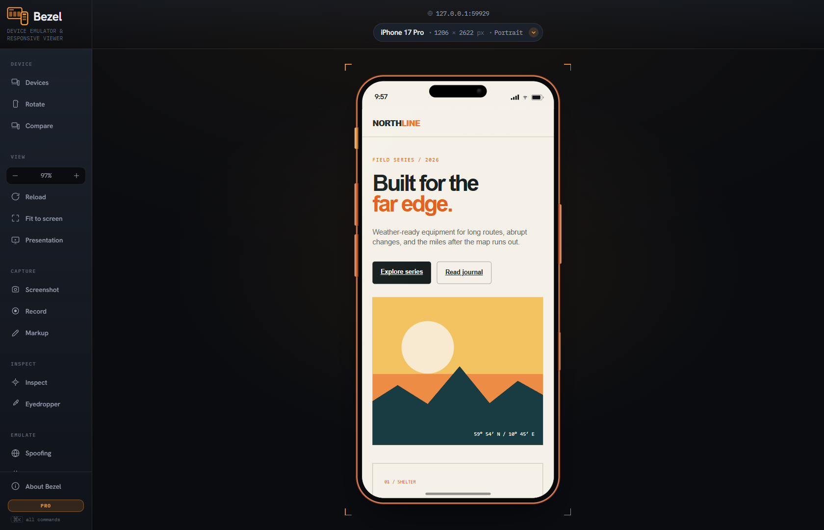
Multiple screens, synchronized scrolling, screenshots, and recent phones are category basics now. Bezel’s case is the complete path from choosing a credible profile to handing off a diagnosed result.
See the researched comparison →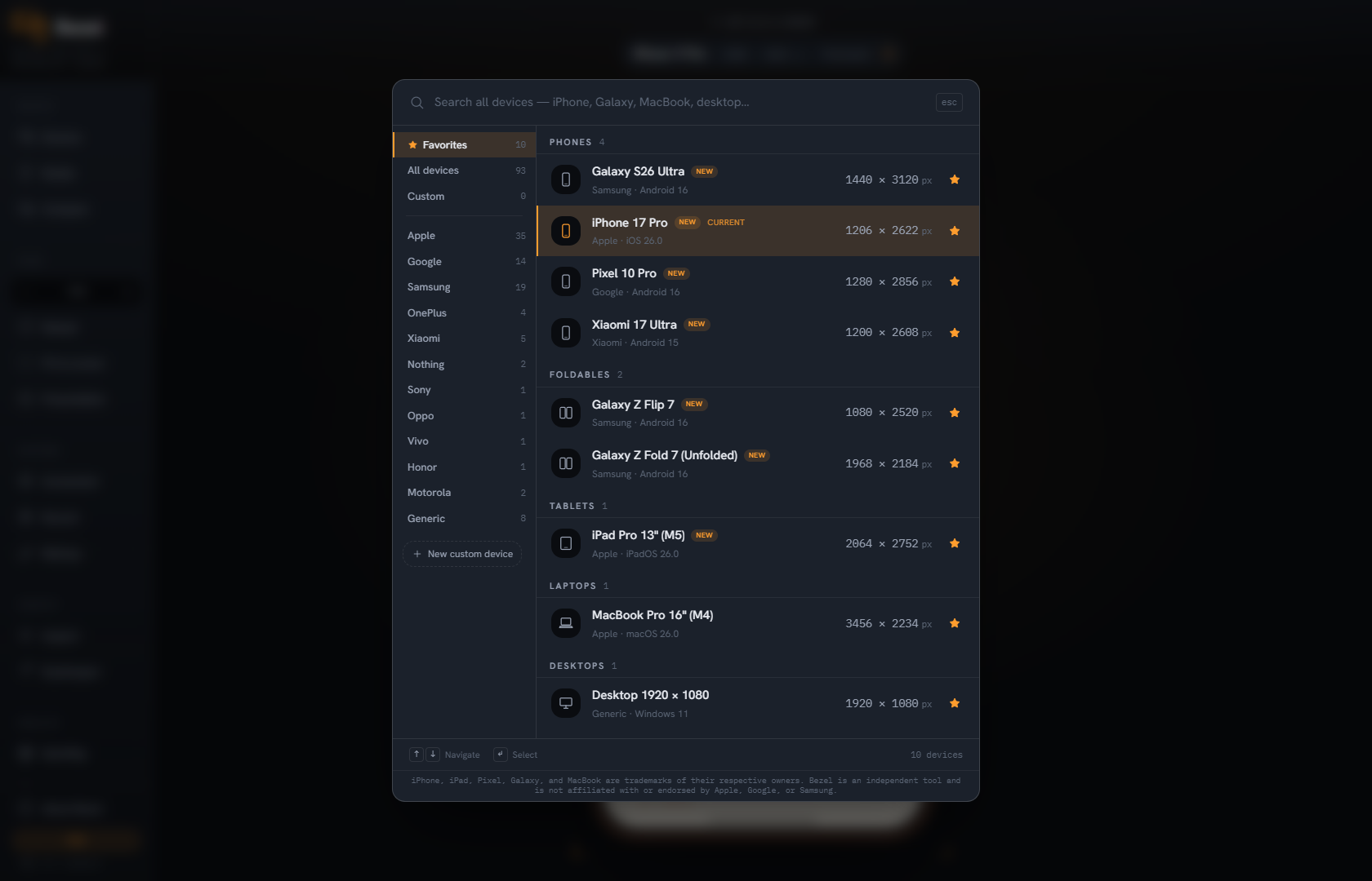
A curated Favorites row puts iPhone 17 Pro, Galaxy S26 Ultra, Pixel 10 Pro, Xiaomi 17 Ultra, Fold 7, and Flip 7 ahead of the archive.
Viewport, DPR, user agent, client hints, touch points, safe areas, cutouts, and frame geometry belong to one maintained profile.
Inspect the box model, measure spacing, identify fonts and colors, check contrast, and use an eyedropper without leaving the test canvas.
Override location, language, timezone, appearance, network conditions, Save-Data, and custom request headers when width is not the variable.
Compare profiles, capture clean or framed output, record a flow, add markup, and export an offline review artifact with context intact.
The device, diagnostics, test conditions, and result stay together instead of becoming a chain of disconnected tools.
Favorites are a maintained default shortlist—not a stale recently-used list. Current Apple, Samsung, Google, Xiaomi, foldable, tablet, and watch profiles open first.
Bezel opens on a deliberately maintained Favorites shortlist. The full catalogue remains one search away, with every signal in each profile maintained as a bundle.
Browse the featured shortlist →1206 × 2622 px · 402 × 874 CSS · 3×
1440 × 3120 px · 384 × 832 CSS · 3.75×
1280 × 2856 px · 427 × 952 CSS · 3×
1200 × 2608 px · 400 × 869 CSS · 3×
1968 × 2184 px · 984 × 1092 CSS · 2×
1080 × 2520 px · 360 × 840 CSS · 3×
2064 × 2752 px · 1032 × 1376 CSS · 2×
422 × 514 px · 211 × 257 CSS · 2×
CATALOGUE STATE
JUL / 2026
Bezel operates on the current browser tab. Pages, captures, recordings, markups, and custom profiles stay on your machine.
Read the privacy model →Every device profile is free. Pro is for turning findings into repeatable evidence and review-ready output.
Open Bezel on any tab and start testing. No trial clock, account, or device restriction.
Start here for everyday responsive inspection.
Install free, then upgrade from inside Bezel.
One licence covers up to five active installations. Firefox includes everything except screen recording.
What makes Bezel different, how the catalogue stays useful, and what you can do for free.
A multi-device view is part of Bezel, not the end of it. Bezel coordinates deeper device signals, adds layout and visual diagnostics, lets you change environment and request conditions, and carries the result into captures, recording, markup, and offline review.
The extension’s curated shortlist currently leads with iPhone 17 Pro, Galaxy S26 Ultra, Pixel 10 Pro, Xiaomi 17 Ultra, Galaxy Z Fold 7, Galaxy Z Flip 7, iPad Pro M5, and Apple Watch Ultra 3. The website reads from the same canonical catalogue as the extension.
Yes. Bezel works in the tab and browser session already open, which is particularly useful for localhost, staging environments, and authenticated applications.
All 93 maintained device profiles, profile testing, inspection, measurement, color sampling, and clean screenshots. There are no catalogue paywalls or ads. Pro adds the deeper evidence, automation, and review workflow.
Chrome and Chromium-based browsers—including Edge, Brave, Arc, and Opera—plus Firefox. Firefox currently omits screen recording.
93 profiles · all devices free · no account