Multi-screen preview
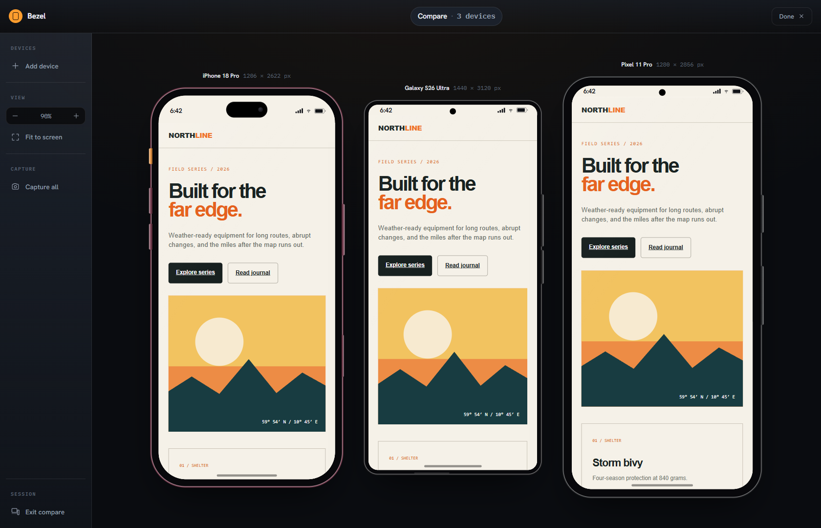
See several responsive layouts at once instead of dragging one browser window through a list of widths.
EXPECTED / USEFULModern responsive tools are good at showing several screens, keeping them synchronized, and taking a screenshot. Bezel starts there—then keeps the investigation moving.
The point is not to pretend multi-view, sync, or screenshots are unique. The point is to connect a credible device profile to diagnosis, controlled conditions, and a useful handoff.
These features matter. They simply cannot carry the whole sales story anymore.
See several responsive layouts at once instead of dragging one browser window through a list of widths.
EXPECTED / USEFULKeep scrolling, navigation, and common actions aligned while checking more than one viewport.
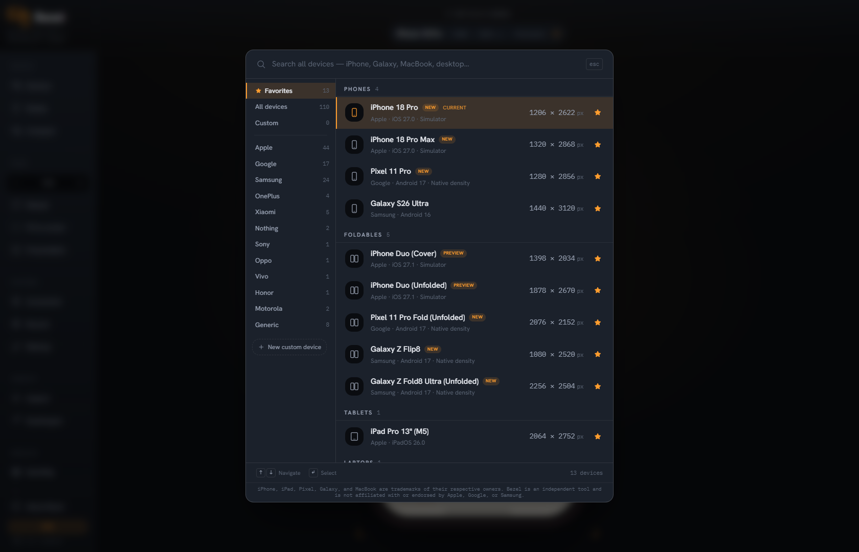
EXPECTED / USEFULStart from recognizable phones and tablets, with an escape hatch for custom dimensions.
EXPECTED / USEFULCapture a visual result without leaving the responsive-testing surface.
EXPECTED / USEFULFour connected advantages turn responsive preview into a practical workbench.
The extension opens on a deliberately maintained Favorites list: iPhone 18 Pro, Galaxy S26 Ultra, Pixel 11 Pro, iPhone 18 Pro Max, Galaxy Z Fold8 Ultra (Unfolded), Pixel 11 Pro Fold (Unfolded), and more. Announced devices are labeled Preview until their availability date.
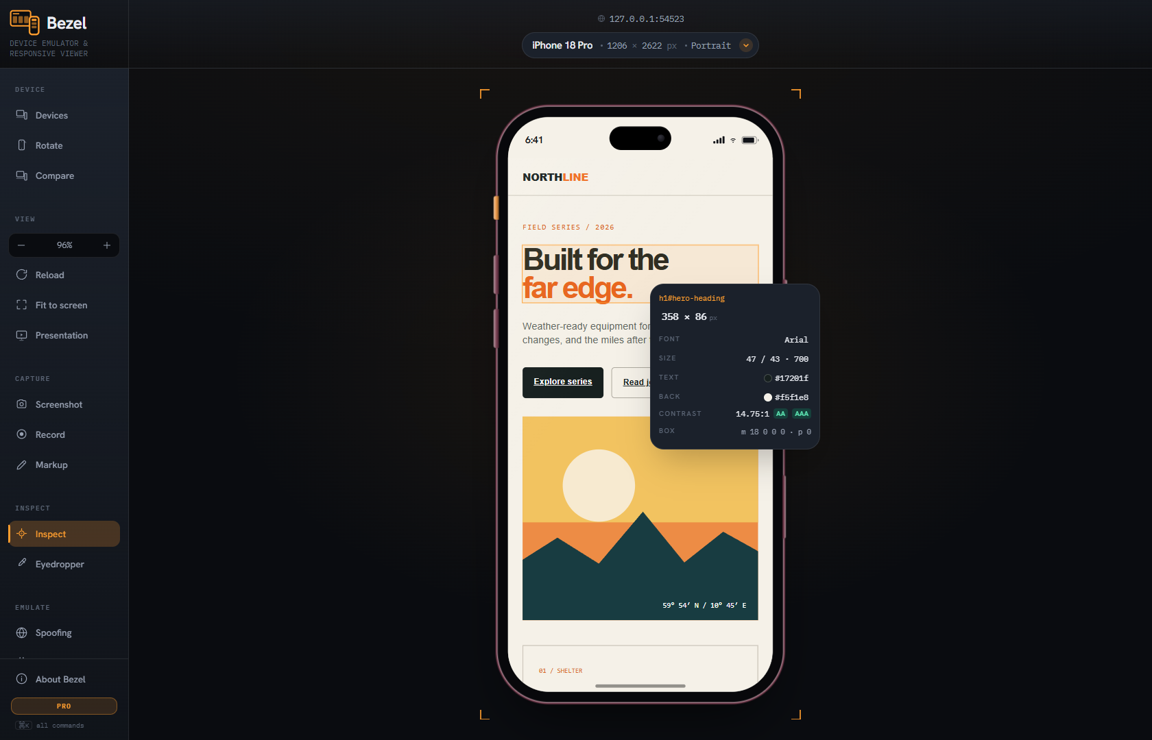
Measure the rendered page, read box-model values, identify fonts and colors, sample pixels, and check contrast without leaving the responsive canvas.
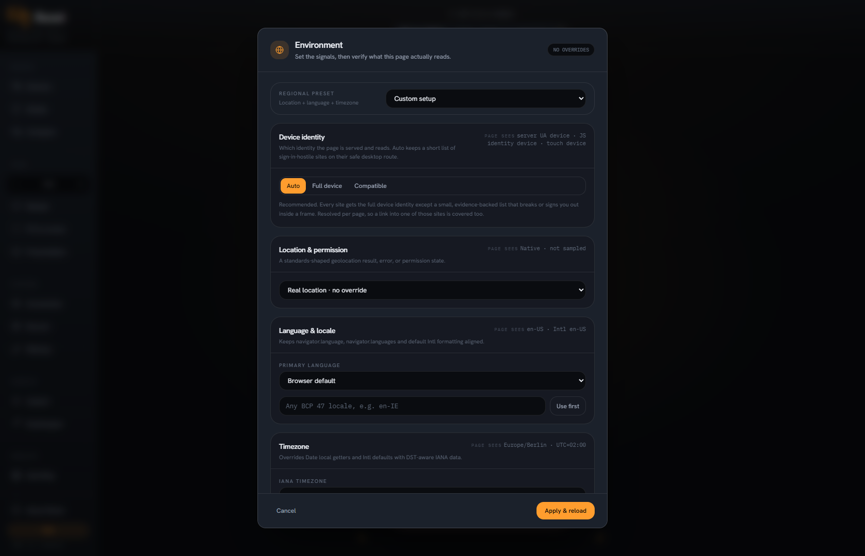
Vary device identity, geolocation, language, timezone, appearance, network behavior, Save-Data, and custom request headers.
Compare independent profiles, capture clean or framed output, record a flow, add markup, and package an offline review artifact.
A general category comparison, focused on where the work usually stops and what Bezel lets you do next.
COMMON CATEGORY EMPHASISA large preset menu that can become an archive.
BEZEL ADVANTAGE+A curated latest-device shortlist first, with all 110 profiles one search away.
COMMON CATEGORY EMPHASISViewport size is usually the primary unit of testing.
BEZEL ADVANTAGE+Viewport, DPR, UA, client hints, touch, safe area, cutout, and frame move as one profile.
COMMON CATEGORY EMPHASISPreview reveals where something looks wrong.
BEZEL ADVANTAGE+Measure, box model, fonts, colors, contrast, and eyedropper help explain why.
COMMON CATEGORY EMPHASISThe device view changes while the surrounding environment stays mostly fixed.
BEZEL ADVANTAGE+Location, locale, timezone, appearance, network, Save-Data, and request headers are controllable.
COMMON CATEGORY EMPHASISA screenshot is the usual finishing point.
BEZEL ADVANTAGE+Compare, framed and composite capture, recording, markup, and offline review keep context attached.
The claim is not that every other tool stops in exactly the same place. It is that Bezel is deliberately designed to keep these stages connected.