How Bezel becomes the device.
Not a resized window, and not a screenshot service. Bezel runs your page inside a device-exact frame and rewrites the signals the page reads, so your own code makes the same decisions it would on the hardware. Here is exactly how — and, honestly, where the limits are.
Runs 100% local · nothing uploaded · no remote debugger, no cloud device
Two layers, working together.
A resized window fails because it changes one number, the width, and leaves everything else saying “desktop.” Bezel changes both things that matter: the box your page renders into, and the signals your page reads about the device it is on.
The frame gives your page a real, device-sized viewport. The shim overrides the browser values your page reads. Together they mean your code is not guessing on a shrunken desktop — it is running as if on the phone.
The frame: a device-exact viewport.
Your page loads in a real frame sized to the device’s exact CSS viewport — an iPhone 17 at 402 × 874, a Pixel 9 at 412 × 924. Because the box genuinely occupies that many CSS pixels, window.innerWidth, visualViewport and every width-based media query are already correct, with nothing faked.
What you see on screen can be zoomed to fit, but that zoom is a separate transform applied around the outside of the whole mockup. It changes the picture’s size, never the viewport your page measures. That is the line between Bezel and dragging a window narrow: a resized window changes what the page measures and is capped by your monitor, while Bezel’s frame is device-exact and stays that way at any zoom.
The shim: overriding what the page reads.
Before your page runs, Bezel injects a small script into the frame, in the page’s own JavaScript world. It redefines the properties a page reads to decide what device it is on, using real property getters, so they read like the browser’s own rather than a shallow copy pasted at one instant.
- Identity. navigator.userAgent, platform, vendor and userAgentData (the JavaScript client hints) report the real device.
- Display. window.devicePixelRatio returns the device’s true density, whether that is 2x, 3x or a fractional 2.625x, so image-set and retina assets follow the phone and not your monitor. screen dimensions and orientation match too.
- Touch capability. navigator.maxTouchPoints, window.ontouchstart and matchMedia(pointer: coarse) all report a touch device, so touch-first layouts and hover fallbacks behave correctly.
- Media features. matchMedia for pointer, hover, resolution and prefers-color-scheme returns the device’s answers, wrapped so listeners added with addEventListener keep working.
It also blocks the page’s own service worker inside the frame, because a stale one can serve a cached desktop shell that would defeat the emulation. All of this runs locally, none of it uses the remote-debugging protocol, and nothing is uploaded.
The headers: getting the mobile build.
Deciding the device in JavaScript is not enough, because many sites choose their bundle and images on the server, from the request. So for the framed tab only, Bezel rewrites the outgoing headers: it sets the device User-Agent and the mobile client-hint flag, and removes the desktop client hints so a desktop signal never leaks through. The server sends the same mobile build a real phone would get.
Two more things happen at this layer. Bezel clears the response headers that stop a page being framed, so a site that normally refuses to load in a frame still works for your own testing. And it forces a fresh fetch on every device switch, so a response cached for the previous device cannot bleed into the next. All of it is scoped to the one tab you are testing, and removed the moment you stop.
State isolation between devices.
Switch from an iPhone to a MacBook and back, and a site that persisted a layout for one can quietly serve it to the other. When you change devices, Bezel clears the framed origin’s cached storage — Cache Storage, service workers, and its localStorage and IndexedDB — so each device renders from a clean slate. It never clears cookies, so your logins survive the switch.
Spoofing the whole environment.
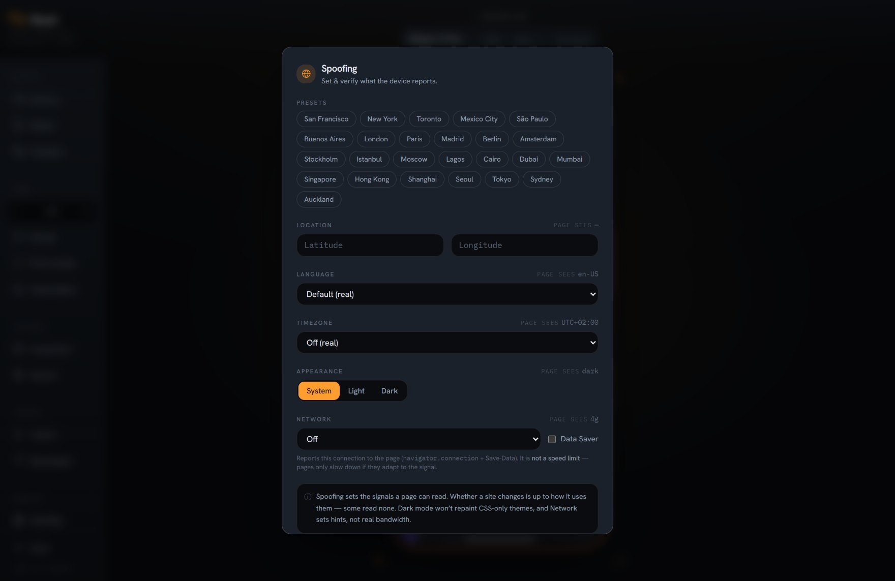
The same approach extends past the hardware. Bezel can set the timezone (patching Date and Intl faithfully, daylight saving included), the language, geolocation, dark-mode preference and the network profile a page reads. And it is honest about the edges: the network profile is a signal your page can read, not real bandwidth throttling, and pure-CSS dark mode re-themes only if the site honours the preference hint.
What it nails, and where the limits are
The whole point of Bezel is to stop guessing. That only works if we are straight about what it does and does not do.
The signals your code branches on
- Device-exact viewport, so widths and media queries are real, not approximated.
- True pixel density, so retina and image-set assets match the device.
- User-agent, JavaScript client hints and the mobile flag, so the mobile build loads.
- Touch-device detection, so touch-first layouts and hover fallbacks are right.
- Timezone, language and geolocation your code can read.
What it does not pretend to do
- It reports touch capability; it does not turn your mouse into synthetic touch events.
- Pure-CSS dark mode changes only if the site honours the preference hint.
- The network profile is a signal to read, not real bandwidth throttling.
- It is not a replacement for final sign-off on physical hardware.
You can see what the page sees.
Bezel’s panel reads the values back from inside the frame, the same properties your page would read, and shows them live. It is not a “should be” table. If an override ever failed on a locked-down page, you would see the real value, not a comforting fake. The tool holds itself to the same honesty this page does.
Works with whatever you build. Bezel frames the rendered page, so it does not care how the page was made. React, Vue, a static site or plain HTML all behave the same inside a real device.
Stop guessing. Frame your first device.
Add Bezel to your browser and watch your page reflow as the real device, in seconds. Free, no account, nothing leaves your machine.